type below and hit enter
Search the blog
This little corner of the internet is where I pour out the lessons and insights I've gathered on my journey, all with the intention of lighting your path as you navigate the exciting world of business. And hey, while you're here, don't miss out on your complimentary website audit – it's on the house! Let's make your online presence shine together.
I'm glad you're here
Web Design best practices list: 10 Best Practices when designing a website
September 23, 2020

Here are some web design best practices.
Have you ever been to a website and felt your eyes trying to figure out where to look? Bad web design will have your leads transfer to your competitors.
In this article, we have listed ten best practices a website should have when designing you or your clients’ site. This list will make sure your leads will stay on your site longer and get engaged with good design.
Ensure you subscribe to our mailing list to get more tips on making your website with the best practices properly.
1. Web Design best practices: Find your Target Audience
As per Google, when knowing your target audience, it benefits not only your web design but the marketing to your audience as well. If you want to convert your clients into buyers, knowing your target audience will allow you to design your website accordingly to pull the correct demographic you are targeting. While figuring out your audience, you want to collect information such as:
- Occupation
- Interest
- Buying Habits
- Income
- Demographic
- Hobbies
- And More
The more information you have on your buyers, the better you will develop your website to meet their needs.
After you get more in-depth information on who are your target audience, you can ask more specific questions such as:
- How to get the correct information to my audience, and what type of information is essential to them?
- What can my website offer to my audience?
- How to improve the user experience to my audience, and what is mandatory functionality to provide to my audience?
These are some things to think about when it comes to the best web design practices in 2020. If you can answer these questions, converting leads will become easier.
2. Figure out what’s your style guide
To every website there is a brand being represented, your brand will have a style guide to represent your brand. Knowing what your style guide is will ensure consistency throughout your website.
Knowing your style guide will give your information like:
- Logo representation
- Font Style
- Color Scheme
- Your Identity
- Image Style
- Brands Voice
When visitors come to your website, they should remember you by your brand and your identity. A style guide gives insight into how your web page should look. It also helps future developers that work on your website an idea of what colors different elements on your site should be.
3. Make navigating your site easy
One of the most slept on web design best practices is easy to navigate through websites. Your navigation has to be organized and functional. The best way to implement this is by making sure your navbar makes sense.
If your users cannot find what they are looking for fast, they will likely leave your website and try again on a competitor’s website. Statistics show that 38% of your visitors will stop engaging with your website if your content and layout are hard to find and unorganized.
Let us take a look at a service provider website called Divine inspirations. On this website, the navbar is simple and straight to the point. You know where everything is as soon as you go to the website.

The website guides you and the steps to takes in purchasing one of her services.
- First, she wants you to learn about her by clicking the about me button.
- Next, her website wants you to know about her services and what her business is offering.
- Last, she wants her audience to contact her once you finish learning about her and her services.
This is a navbar that keeps it simple and is well organized. Users can find her services and how to contact her all from looking at the navigation bar.
4. Make sure your layout makes sense for each page
When designing your website, your page layout is crucial. You always want to make sure that you are creating your website with customers in mind. We call this User Experience(UX design), which is a core concept in web design.
Each page will have a different layout depending on what web page you are currently designing, but you will still have a similar structure to keep the consistency with other web pages. Consistency is critical as it is your brand and how you’re website is identified for design purposes.
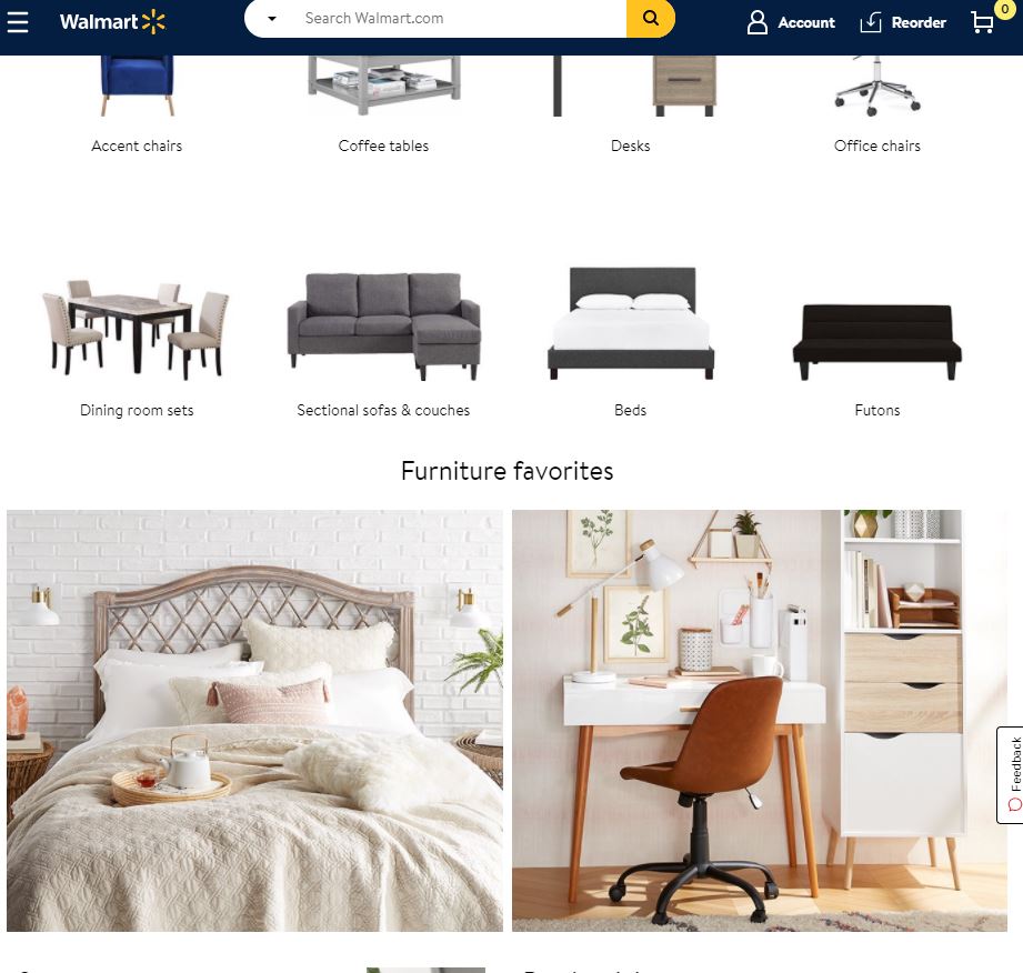
Let us look at Walmart’s furniture page, these photos represent Walmarts products, and the images are laid out to show what items are essential and currently have deals.

Different page layouts are confusing for your audience. Remember, the goal is to retain and convert your audience and what you don’t want to do is have your audience think that they are on a different website.
5. Compress all photos on your site
Next on our web design best practices list are the images on your website.
As we all know, images are an essential part of your website. They create visuals to represent all the text on your website, and of course, you want those images to look as high quality as possible. Quality pictures make your website look like you are qualified and allow visitors to think that you are trustworthy enough to purchase.
Implementing high-quality images can cause your websites loading time to tank fast the more photos you add onto the site. Slow sites cause visitors to leave, and that is not what we want. Not only will visitors leave, but your website will also take a hit in the SEO department, which will kill your organic traffic. You usually want your web page to take two seconds to load to retain your customers.
The best advice we can give is to compress your image files. You can do this by using tools like Kraken that compress your images without losing your quality.
Keep in mind that your images aren’t the only thing to keep your eyes on, but all media files you upload to your websites. Videos are another file that will tank the performance of your websites. You can use other platforms, like Wistia or Youtube, to upload your videos, copy the embedded code from them, and then paste them on your website. This process will allow videos not to slow down your website.
6. Web Design best practices: Use your white space
Utilizing whitespace is an essential but forgotten web design practice. While building your website, you want to give your site space; there’s no need to overload your web page with text and images. This goes back to a very important acronym in the web design industry called K.I.S.S (Keep It Super Simple).
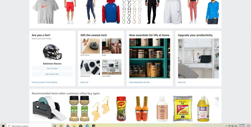
Simple designs don’t allow your audience to be confused as simple web designs tend to remove chaos and are very readable. We want the information on the page to engage the readers enough to stay long enough for them to want to buy what is being offered. In the example below, we see how Amazon utilizes whitespace to make the website easier to read and browse.

7. Make Call to Action(CTA) buttons noticeable
A website should be used as a guide to get people to buy from your website. It is for people to figure out what your product and services are and if they like it. So what’s next after they like what they see? They would want to know the next steps, this is called a call to action(CTA), and without a CTA button, your buyers won’t know how to become a buyer.
Be sure to create CTA buttons that stand out and pop off the page, so your visitors don’t miss them.

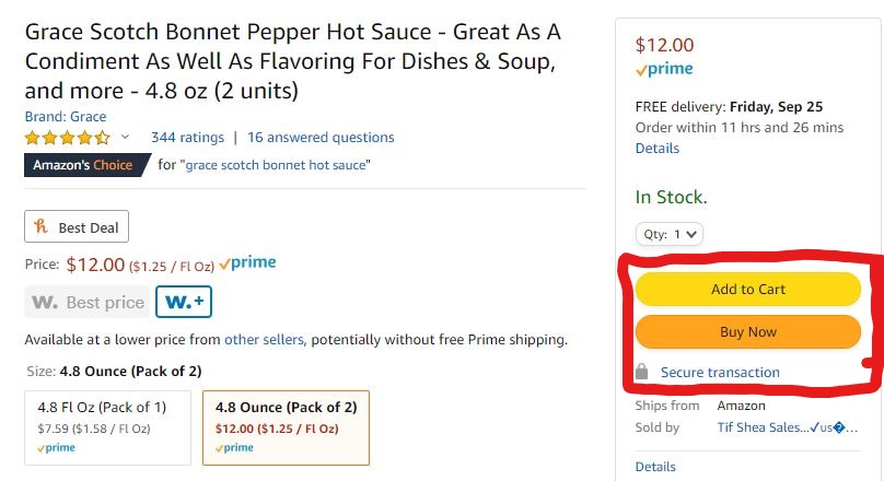
In this example, from Amazon, the CTA button is bright compared to the rest page; it only stands out. Both of these buttons lets the audience know to “Click Me” before the user even reads the text on the button.
These types of buttons are valuable for guiding your users in taking the next steps. From wanting your user to buy or even signing up for a mailing list, make it obvious for them.
8. Build mobile-responsive Websites
Building for only websites in 2020 is just lousy thinking as a web designer and having a mobile-responsive website is critical in this day and age. In 2020 most of your viewers and internet traffic will be coming from a mobile device; this is mandatory to serve in today’s virtual environment.
Mobile-friendly websites will increase user engagement with your business, which will boost sales for your business overall. Stats show that 87% of users are more than likely to buy from there mobile device than not. It is more important to make your mobile site designed well more than the desktop version of your site.
The best way to ensure that your website looks good on mobile is to implement responsive design. Responsive design allows your website to work on any device without much effort. No matter the screen size of your website, a responsive design will make sure your design fits any screen.
As a result, the experience you will provide to your audience will be more than enough to keep them engaged and thoroughly not disgusted.
9. Make sure your website is Search Engined Optimized(SEO)
A web design practice that most beginners ignore is optimizing your web site for search engines. Investing in search engine optimization (SEO) will help you rank your site for search engines like Google and Bing.
This involves strategies like:
- Creating Keywords
- Adding link to other web pages
- Improve and Updating your content
- Adding a Hook
- Making your content look amazing
- Doing a lot of research on your competitors
What’s the point of having a beautiful website if you don’t have the traffic for people to see. SEO drives organic traffic to your website of people that care for the content you are giving out.
10. Web Design best practices: Heatmaps
Have you ever wondered where your users are spending the most time on your website? Heatmaps provide feedback on where your audience is spending most of their time on your site. They track your users’ mouse movements so that that you gather data on what areas receive the most attention.
You can use this information to:
- Optimize your design using data: Use the heatmaps data to focus more on those specific areas of your web page. You can develop a hypothesis to design your site best fit for the data acquired from your site.
- Optimize your “call to action” placement: Use the heatmap to know where to place CTAs, which will increase your conversion rate.
- Fix your navigation: Heatmaps can monitor if your navbar is working correctly. If your buttons aren’t attracting user attention, you can design your website accordingly to make your buttons a little more noticed.
You have the confidence to make the correct changes using heatmaps. Use this data to convert and make the User Experience(UX) better for your audience.
Take Action
The tips provided, you can now start optimizing your website to convert your next clients. These tips are only the beginning and can take you to the next level of your business.
If you see that you need to make a lot of changes or that all of this information is overwhelming, trust me, you aren’t alone.
Our team here at Rooted Webs Design Studio is here and ready to help. We have a total of 10 years of experience in the tech industry and are prepared to take your website to the next level with 100% custom design. We also implement the best SEO practices to allow your website to be ranked in search engines.
This little corner of the internet is where I pour out the lessons and insights I've gathered on my journey, all with the intention of lighting your path as you navigate the exciting world of business. And hey, while you're here, don't miss out on your complimentary website audit – it's on the house! Let's make your online presence shine together.
I'm so glad you're here
Hello There!
© 2020 - 2025 Rooted Webs, LLC (DBA Rianne Nycole Designs). all rights reserved.